What is Embedded Analytics?

What is Embedded Analytics?

Published

July 25, 2022

Data Analytics

With modern data analytics, businesses have improved their operational efficiency, removed costly bottlenecks, and driven revenue growth. They are using dashboards within business intelligence platforms to make data-driven decisions.

However, there are often missed opportunities to drive better results through access to data insights during day-to-day activities. Dashboards and key insights are locked within business intelligence platforms. If employees have to toggle between applications to understand the state of the business, they are missing out on important data to make informed decisions that have a big impact on the bottom line.

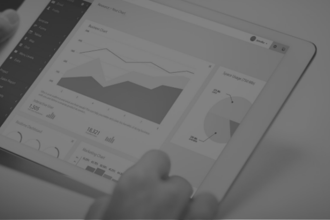
Embedded analytics places these insights at the point of need, inside portal and workflow applications, and makes it possible for users to take immediate action without needing to leave the context of their day-to-day work. It drives efficiencies within workflows and significantly increases user adoption of your analytics investments.

Integrating data analytics into web applications allows the business to take immediate actions on insights that may currently be hidden in reporting applications.

Why consider embedded analytics?

1. Actionable Insights, where action can be taken By embedding analytics into your user’s workflow, decisions can be made by taking the state of the business into consideration. Analytics can be gleaned in the context of your workflow, allowing for better, more informed decision-making.

2. Creates a culture of data-driven decisions With insights no longer hidden in analytics applications, users are empowered to make decisions based on factual data, not opinion, leading to better business outcomes and reducing the risk of bad or uninformed decisions.

3. Improved data governance By giving your internal applications the ability to embed analytics from a single source of analytics, you reduce the risk of multiple implementations of the same insight or calculation. All users of your data will now see the same validated and centrally governed data analysis that they can trust.

4. Better user experience Traditional analytics applications offer a streamlined way to build reports and dashboards, embedded analytics takes those concepts to the next level by allowing them to create a seamless experience in other applications used by the business, whether they are web applications or mobile apps.

5. New revenue opportunities Embedded analytics allows businesses to monetize their data by offering analytics access for their customers inside their product offerings or creating upsell opportunities.

How to get started with
Embedded Analytics

Getting the best possible business results with embedded analytics requires the right technology stack for your business, and experience integrating data and applications.

One Six Solutions consultants are experienced in both building web-based workflow applications as well as delivering on your data strategy. We are uniquely positioned to deliver embedded analytics that allows your business to make more informed decisions quickly and efficiently.

If you would like to see how we can help with your embedded analytics project, contact us today for a Free Consultation

Streaming Data Analytics with Azure IoT and Power BI

Streaming Data Analytics with Azure IoT and Power BI

Published

May 1, 2020

Data Analytics
Microsoft Azure
Power BI

Recently, we had a client reach out with an interesting challenge – to see a data stream from a device visualized in real-time without the need to refresh the page for updated results or even wait for a data pipeline to run its next scheduled job. The foundation of our solution was Microsoft Azure, where organizations can quickly deploy scalable, managed services around Internet of Things (IoT) applications. So, here is what we built – a combination of Azure components as the base architecture and Power BI’s streaming data set for visual analytics.

At a high level, four key pieces in Azure are required to get messages from a device to the live visualizations in Power BI – The IoT device sends a message to Azure IoT Hub. When this message is received, an Azure Function transforms the message into the proper JSON format and sends an output to an Event Hub. When the Event Hub receives the message, Azure Stream Analytics pushes the message to a custom Power BI dataset. Lastly, this allows the data to move in real-time in Power BI without a data-sync related delay. Let’s walk through these components in detail. 

Create an Azure IoT Hub

To build this solution, the first component needed is an Azure IoT Hub. This hub serves as a manager for all your IoT devices, provides security, and ensures reliable communication between the device and the hub. In a production scenario, these IoT devices could be any of the numerous smart devices found in a workplace. But for this example, we will be simulating a raspberry pi sending messages. Setting up an IoT hub is simple. Navigating to the IoT Hub pane within Azure, selecting “Add”, entering your preferred resource group, and creating a name for the hub will get the hub up and running. Creating a test device is just as easy. Within your new IoT Hub, select IoT devices and click “New”. There are settings for the device, but only an Id for the device is required to get it running. If done successfully, the device should appear in the list.

Figure 1- Azure IoT Hub Device List

To test the device, we used Visual Studio with the Azure IoT Hub extension enabled. Once connected with Azure, the test device should be visible. To test, right-click the device and select “Send D2C Message to IoT Hub” (Fig 2). This allows you to send plain text or a JSON template to the IoT Hub. The successful message count can be seen within the IoT Hub metrics by selecting the “Telemetry Messages Sent” metric.

Figure 2 – Visual Studio – Azure IoT Hub Extension D2C Messages

Configure an Azure Event Hub

Next, the Event Hub needs to be created. The Event Hub is an ingestion service that helps process streaming data. While this may not be necessary for all projects depending on the message source and format, we included it to do data transformations with an Azure Function. This Event Hub will take the output from our Azure Function and connect with an Azure Stream Analytics Job to send data to Power BI. Creating an Event Hub namespace is like IoT Hub, which requires a name, pricing option, and resource group. Once the namespace is created, an Event Hub entity can be added under the “Entities” pane.

Figure 3 – Azure Event Hub Namespace and Event Hub Entity

Develop an Azure Function

In our example, an Azure Function is necessary because the JSON format required by the Stream Analytics Job did not match the string format of the messages coming from the device. So, with the Azure Functions extension within Visual Studio, we created a new function with an IoTHubTrigger template. This trigger means that every time the IoT Hub receives a message, the function will run with using the message’s data. This function will connect with the IoT Hub using the “Event Hub-compatible endpoint” within IoT Hub’s Built-in Endpoints which can be found under your IoT Hub settings.

Figure 4 – Azure Function

This small function returns the data from the message in a JSON object format to the previously created Event Hub as a new message. The function connects to the Event Hub using a connection string found within the shared access policies for the Event Hub Namespace. Developers should store the connection strings within the local.settings.json file that is created when using the IoTHubTrigger template. After deploying the Azure Function, the connection strings should be entered within the configuration settings on Azure.

Connect an Azure Stream Analytics Job

The next piece required is an Azure Stream Analytics Job. This is what relays the data from the Event Hub to Power BI for live visualizations. Creating a new Stream Analytics Job also requires a name and resource group. Once created, an input and an output need to be configured to relay messages. Stream Analytics has three input options: Event Hub, IoT Hub, and Blob Storage. All settings should be applied when creating an input by selecting the existing Event Hub and choosing the JSON serialization format.

There are many options for the stream output, including Event Hubs, SQL Database, and Blob Storage. We will select Power BI as the output for this project. Once authorized with Power BI, all that needs to be entered is the dataset name and the table name. This will then automatically create the dataset in Power BI. Please note that the data set won’t be created until the first row of data is streamed.

The final step for Stream Analytics is writing the query to get the data desired. Only the EventProcessedUtcTime (needed to show time on a Power BI data visualization axis) and your data column are required but there is no limit. The query must specify the data is from the event hub input and is being pushed to the Power BI output using the same names specified when they were created.

Figure 5 – Azure Stream Analytics Query

Stream Data with Power BI

Figure 6 – Power BI Tile Settings

The final piece of the process is to create the dashboard in Power BI. This dashboard needs to be created in the same workspace where the Streaming Analytics Job dataset was created. When adding a tile, select Custom Streaming Data to choose the dataset and configure the settings. For tiles that require an axis, the EventProcessedUtcTime column must be selected as this allows for the axis to move as more messages are being sent over time. The time window to display setting sets the maximum time on the axis (Fig 6).  From our testing, shorter time frames respond better to frequent messages, but this setting can be changed for each visual so choose what best provides the intended effect.

Once all the components have been configured, it is time to test. If using the IoT test device, the best way to test is to send messages from Visual Studio using a D2C message with the Azure IoT extension. Sending many messages allows time for troubleshooting.

Troubleshooting

If data is not being shown in Power BI, there are a couple of things to double-check. First, try refreshing the Power BI page while messages are still being sent. Sometimes the original connection might not refresh once messages are starting to be sent. If there are still no messages, edit the dataset and turn off historical analysis. This setting allows for saving data and can cause issues if data types change. A third troubleshooting location is in the Stream Analytics Job. If data is not in the proper format, Stream Analytics will show a warning for the input or output. Data will not show in Power BI until it is in the expected format.

Functionality

While Azure and Power BI provide one of the best solutions for live streaming data in terms of ease of use and functionality, this setup is not perfect. Power BI does have some limitations when it comes to custom streaming datasets. The most prevalent issue is the lack of customization. There are only five tile choices for the dashboard – card, line chart, clustered bar chart, clustered column chart, and gauge. These are some of the simpler visualization options Power BI offers and limits the ability to create more complex dashboards for greater insights. There is no ability to change the visualization colors, which leaves users stuck with the default green color option. This prevents users from matching the theme of their Power BI environment causing the dashboard to clash with other pages.

The other common issue with this system is the lack of error reporting. When something is not working – data not loading in Power BI for example – there is often no error code presented to the user. The user must go step by step through the process until the issue is found rather than skipping directly to the error. While there are some limitations, these problems are more related to the user experience rather than the functionality of the system. Overall, this system does exactly what it is intended to do and can provide great live insights into your IoT devices.

OneSix is a Microsoft Aszure Consultant

We help companies solve their most complex problems with cloud technology and yield incredible results.

Power BI Shared Datasets vs Cubes

Power BI Shared Datasets vs Cubes

Published

March 31, 2020

Data Analytics
Power BI

Microsoft continues to develop their business intelligence stack, recently taking the next step to create a concise and unified ecosystem by enabling shared datasets. For businesses that rely solely on the Microsoft stack for their warehouses, SQL Service Analysis Services (SSAS) and Visual Studio have been the rule of thumb for data modelers, but Microsoft is changing this paradigm.

Microsoft has released permissions that allow Power BI datasets to be published out to the organization, groups or individual users. Data models can also add tags such as “Promoted” and “Certified” to move these shared datasets to the top of the list and allow the organization to provide some differentiation between the sets as they see fit. 

This new feature moves warehouse development a step closer towards one ecosystem. Now modeling and report creation can now be done and managed within one application. For example, if a new column is added to a dimension table in SSAS and needs to be added to a report then the designer needs to (1) connect to the cube in Visual Studio, (2) refresh the data source or table, (3) add new column to model, (4) save or publish the cube, (5) close Visual studio, (6) open the power bi desktop file, (7) refresh connection to cube, (8) edit report and (9) publish report. With Shared Datasets, modelers can simply open the power bi file containing the dataset and refresh your dataset. If that file is the same one that contains the report, then you are all ready to make your edits. No need to jump through hoops and switch applications.  Simplification is now the name of the game.

Another benefit of shared datasets is the progress towards achieving a “single source of truth.” Datasets can now be shared across workspaces so that different departments or types of users get their information from the same source. Visual tags let the user know which dataset should be used. This will help to curtail the use of rogue sources and unsubstantiated numbers within an organization, while also providing users the freedom to build new reports knowing that the data has been vetted and validated.

A final minor benefit of shared datasets is enhanced management of the gateways. The gateways are the tool that pulls from the data source and refreshes the dataset. Previously, a different connection was needed for each cube. Now, all you need is a connection to the data warehouse, providing less overhead and only one connection to manage and maintain.

When a brand-new piece of functionality replaces a long-standing one, it is important to be aware of potential trade-offs. The long history of SSAS has led to development of a lengthy list of features at the developer’s hands. One key element missing from Shared Datasets is the robustness of its security. SSAS allowed for the creation of row, column and even cell-level security that could be tweaked by a modeler. With shared datasets, row level security can be handled with roles but compared to the flexible and dynamic nature of SSAS, it can seem lacking.

Another consideration in the jump to Shared Datasets is the performance. Time will tell if models created in Power BI will be able to have the same throughput, calculations, and performance seen by SSAS. Finally, as with any new tool, it is important to consider the support it will receive. Whether it is widely adopted, and Microsoft continues to add to it, or it is abandoned, and the model creation will need to be overhauled again has yet to be seen.

We’re excited to see how shared datasets enables better data uniformity and shared ways of working, and happy to help your organization explore this new feature.

OneSix is a Power BI Consultant

We help companies solve their most complex problems with cloud technology and yield incredible results.

Setting default date to Today with an option to set custom date in Tableau

Setting default date to Today with an option to set custom date in Tableau

Published

October 16, 2019

Data Analytics
Tableau

Tableau is one of the best business intelligence and analytical tools out there to get insights about your data. It is very interactive and easy to use but it can be difficult to get some basic filtering to work. In a recent project I worked on, the client wanted to get metrics in a date range but wanted the dashboard and reports to default to today’s date. Tableau doesn’t have this feature built in.

Tableau does have date filters that are great and in most scenarios, those should suffice however in my case I needed the workbook to display metrics for current date by default and give the user an option to choose from a custom date range. Here is a how I did it. The solutions consisted of:

The solutions consisted of:

3 parameters (the type of date to select, Start Date and End Date)
A calculated field to be used as a filter.

First, Lets start with creating a list parameter titled “Date Type” with a data type of string and the list of values of Today and Custom Date. Set the Current value to “Today.”

We then create 2 additional parameters for “Start Date” and “End Date” with a data type of Date, Display format to Automatic and Allowable values to All. These parameters will give the user the ability to select the date range.

Start Date and End Date parameters

Now that the parameters we need have been created we need to add the functionality so that the data displayed matches accordingly to the selected option a user chooses.

To do this we will create a calculated field called “Date Filter.” It looks something like this:

The IF statement sets a filter condition based on the Date Type selected by the user. If the condition matches the result is a 1 otherwise it will display a 0. This calculated field will be created as a measure. Right click on the field and convert it to a dimension, drag it to the filter shelf and select 1 in the value.

That’s it. Now go ahead and add the parameters to your report and the users will have the ability to select a date type for their reports and dashboards.

Today vs Custom Date selection

Today vs Custom Date selectionThis is a quick solution to creating a date field that defaults to today in addition to giving an option to specify a custom date. Additional customization can be done to hide the Start Date and End Date parameters when Today is selected from the drop down.

Another application for this can be having preset time periods. For example you can add YTD, MTD WTD values in the date type parameter and when YTD is chosen the dashboard displays a comparison between YTD this year vs last year.

OneSix is a Tableau Consultant

We help companies solve their most complex problems with cloud technology and yield incredible results.

Building a “scrollable” dashboard for the iPad in Tableau

Building a “scrollable” dashboard for the iPad in Tableau

Published

October 3, 2019

Data Analytics
Tableau

A recent customer request for a “scrollable” dashboard in Tableau left me stumped for a while. I thought I’d share what I learned as it took me quite a bit of online search time and experimentation to reach the solution.

The customer intended their new dashboard to be accessed via standard-issue iPads (made available to each member of their management team). The dashboard width would be set appropriately for the screen size of these iPads. The dashboard length would be variable, as the vertical space required to present the last chart could differ substantially based on the dashboard user’s selection of the geography to filter to. The customer stated that they wanted the last chart to take up as much space as it needed for legibility, and that users should be able to scroll down through it by swiping their iPad screen.

I can’t share the dashboard that I made for my customer, but I have made a similar one (using publicly available data) for illustration purposes. Below is a partial screenshot of that dashboard:


Users of this dashboard may select a US Census region from the filter drop-down at top right. The top-most chart then displays overall marriage (formation) rates for that region for the years 1999 through 2016. After that we have a chart that displays marriage rates for each of the states making up the region for the same period. Since the number of states to be displayed varies by region, it isn’t possible to set a fixed height for this chart. It will have to be able to dynamically resize so that information for each state remains legible.


The first step in building this dashboard was to set its’ size appropriately. I set it to Fixed size with a width of 1024 pixels (standard for an iPad) and a height of 4000 pixels which is the maximum height that Tableau currently allows. I had first tried setting up the size using the Ranged option, allowing the height to be variable. I found that, with that option, my second chart was not consistently free to resize regardless of how I set the height range. With a fixed height of 4000 there will be white-space below the dashboard, but it’s easily ignored by the user on an iPad.

This dashboard flows vertically not horizontally, so the next step was to drop a vertical layout container onto the dashboard canvas (leaving the default “Tiled” mode selected for the layout). I then dropped a horizontal layout container inside the vertical container, checked the “Show dashboard title” option and dragged the title inside the horizontal container.


I dropped the first chart, showing overall marriage rates for a select region, into the vertical container so that it could take up the entire dashboard width. Dropping in that chart caused its’ accompanying Region drop-down to appear on the dashboard. I moved it inside the horizontal container so that it would appear (opposite the title) at the top of the dashboard. Finally, I dropped in the second chart, showing marriage rates by state, below the first in the vertical layout container.


Initially both charts were defaulted to dynamic height and “Standard” fit to their layout container. I set the first chart’s fit to “Fit Width” and then fixed its’ height by clicking and dragging its’ lower edge to the desired position.


I set the second chart’s fit to “Entire View” but this had the immediate effect of stretching the chart vertically to take up all the remaining vertical height. In this example dashboard the effect is not disastrous, but in the dashboard built for my client this created a pronounced “funhouse mirror” effect on the chart for some geographies.


I tried to resize the second chart by clicking and dragging, but Tableau wouldn’t permit any vertical resizing of the chart. I found that I could resize the chart by selecting “Edit Height” from the chart’s options menu (down arrow in the upper right of the screenshot above). However as soon as I was able to resize I realized that wasn’t really what I wanted: the whole point was to let this chart have dynamic height, but I didn’t want it taking up the entire available vertical space.

Finding a way to get the right kind of control over the chart’s sizing took me longer than I care to admit. The solution hinged on another available dashboard object that I had not yet used: the blank. When placed as the “last” object in a layout container, a blank object expands by default to take up any unneeded space in the container after the preceding objects in that container are sized. I dropped a blank into the vertical layout container below the second chart, then made sure that the “Fixed Height” toggle (the “pushpin” pictured above) was turned off for both the second chart and the blank. With that simple change, the second chart expanded and contracted in a natural manner based on the region selection made by the user. The blank “soaked up” the rest of the 4000-pixel vertical space.


I’ve since learned that the blank can come in handy whenever you need more control over the spacing of other dashboard objects and you want to stick with the “Tiled” layout type. Hopefully, paying attention to the humble blank will keep you from some of the problems I’ve encountered as you build your own Tableau dashboards!


Ajit is an AWS Certified Solutions Architect and a member of the One Six Solutions team.